Drawdown Georgia
In collaboration with a team of UX designers, content strategists, and climate researchers, I helped create a website that would inspire and engage Georgia residents to solve for climate change.
Project
Responsive Website
Client
The Ray C. Anderson Foundation
Duration
3 Months | 2020
My Role
Participated in research, led UI design, collaborated with a UX designer, delivered a UI kit, XD files, and feedback to developers.


BACKGROUND
They had the science and data. But how could they reach the people of Georgia?
The Ray C Anderson foundation had a mission: to position Georgia as the first state-centered effort to solve for climate change. So they assembled a team of businesses, universities, municipal policymakers, NGOs, and others around 21 solutions specific to Georgia’s unique economic, natural and social resources. Their goal was to equip and engage Georgia residents with these solutions so that they could collectively initiate change and accelerate the reduction of carbon emissions in Georgia by 2030.
My team was asked to create a platform that could tell the Drawdown Georgia story through visuals and real-time data and to build and engage a subscriber community in “bringing climate solutions home.”
RESEARCH
We used existing research and conducted focus groups to help determine how our users currently felt about climate change.
We could see from the SASSY survey that Americans were becoming more worried about global warming and more supportive of climate solutions. We saw this even more clearly when we conducted focus groups and forums throughout Georgia. Many of the people we met were in the “alarmed”, “concerned”, and “cautious” categories.
We put together user personas and presented our strategy to the stakeholders. We were ready to begin designing.
Global Warming’s Six Americas, September 2021

COLLABORATING WITH THE UX DESIGNER
Synthesizing UX with UI.
I worked very closely with the UX designer throughout this project. We met via zoom to discuss his wireframes then again when I skinned them with my designs. We had frequent check-ins to make sure the functionality, flow, and overall experience was working. I used XD commenting to get feedback from the UX designer, the copywriter, and our clients. This made communication much more efficient.
Not everyone always saw eye-to-eye, so I was responsible for finding the middle ground. When copy became too dense, I made some interactive decisions that helped consolidate information. When the order of something wasn't right from the original wireframe, I would find a way to resolve it and communicate with my team until we found the right solution.

AFTER:
BEFORE:
PROBLEM SOLVING
Persuading through design.
One issue I helped resolve in particular was the “Carbon Reduction Visualizer.” An interactive chart that helps users to visualize solutions that, if implemented at scale, could put Georgia on a path to achieve carbon neutrality.
I knew that the user needed to be able to hover over each wedge to get more information, but the 21 wedges were getting really small as the y-axis was ranging from 0Mt to 180Mt. So I discussed with the researchers if it was possible to change 0Mt to 60Mt since that was the goal we were aiming for by 2030 anyway. I quickly prototyped both the “wrong” and the “right” options to show how much more user-friendly it would be if we could enlarge the wedges a bit more. They agreed to this solution.
PROBLEM SOLVING
Optimizing for mobile.
I then realized we needed to come up with a different solution for mobile, since hovering over and especially tapping on the wedges would not be possible. I proposed we design this content as accordions.
“This looks great, Sterling! Thanks for capturing all of the details we discussed today.”
- CLIMATE STRATEGIST

DEVELOPMENT HAND OFF
Providing Assets.
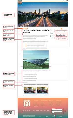
We had been discussing the designs with the developers early on to make sure we were designing within the realm of possibility. When the designs were ready, the UX designer and I did a final walkthrough with them. I explained how everything should behave, interact, and link. I then provided assets for both desktop and mobile and included annotations that described all that we had discussed in detail. We continued communicating as they built, and I would suggest modifications when necessary.
Finally the website was complete! Our clients were ecstatic.

Final Product:
Results:

665 SITE VISITS
IN THE FIRST MONTH

49% CONVERSIONS
IN THE FIRST 5 MONTHS

PRESS RELEASES
IN THE AJC, GRIST, & OTHERS
Learnings:
THE ART OF COLLABORATION
There’s a fine art to balancing everyone’s opinion with best practices in order to create an ideal experience. I really enjoyed how much respect my team & clients had for each other and appreciated how open-minded and constructive everyone was. I enjoyed finding the best solutions together.
COMMUNICATION IS KEY
Communication is key in keeping up with all the moving pieces. I learned the value of regular check-ins, messaging, and tools like XD commenting. I became very efficient in gathering feedback, responding, and calling out any potential issues.
"SHOW" THE SOLUTION
Articulating your design decisions to stakeholders sometimes requires showing not just telling. I became proficient at prototyping and proposing visual solutions. I learned to be adaptable and ready to pivot at any moment.


